
<symbol> elements and the storefront serves it merged over the default set: a symbol whose id matches a default icon replaces it everywhere it appears, and any other symbol becomes an extra icon you can reference from custom components.
How it works
Every checkout page references its icons from a per-store sheet served aticons.svg (relative to the checkout URL — e.g. /{storeId}/icons.svg, or /checkout/icons.svg behind your own domain’s reverse proxy). The served document is the default set with your uploaded symbols merged in by id, so you customize icons with data, not code.
Admin Configuration
- Navigate to your store in the admin dashboard
- Open Settings and click the Icons tab
- Drop your SVG sheet — it is validated and every symbol is previewed in a grid with its id
- Upload — changes reach shoppers within about a minute
<symbol> elements:
icons-sheet.svg
Default icon keys
Overriding works by exact id match. These are the default icons and their keys — upload a symbol with the same id (PascalCase) to replace one: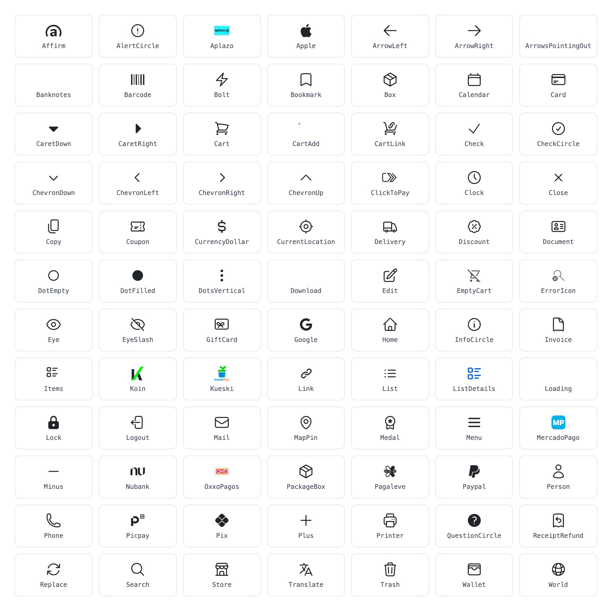
Using extra icons in custom components
Any symbol that doesn’t match a default key is served alongside the defaults. Reference it from a custom component with a standard SVGuse element and a relative href, so it resolves on every host and path:
Theming contract
Icons are colored with CSS custom properties that inherit into the symbol — set them on the referencing<svg> or any ancestor (your theme tokens work here):
Symbols authored in the common
currentColor style (the convention of most icon libraries) work without changes — the checkout bridges --icon-stroke/--icon-fill through the inherited color. For full theming of your own artwork, follow the default sheet’s pattern: keep a literal color as the attribute and put the themable value in a style attribute, e.g. stroke="#212529" style="stroke:var(--icon-stroke,#212529)".
Stroke width does not scale across viewBoxes: an icon drawn in a
0 0 256 256 viewBox with no stroke-width renders hairline-thin at icon size. Either bake a proportional stroke-width on the symbol (e.g. 16 for a 256 viewBox) or author in a 0 0 24 24 viewBox like the defaults.Validation and limits
The upload is validated for safety, not style — you’ll get actionable errors for anything rejected:- File:
image/svg+xml, at most 1 MiB - Ids: start with a letter; letters, digits, hyphen and underscore only; unique within the sheet
- Not allowed:
<script>,<foreignObject>,<style>elements, event-handler attributes (on*), and any external URL reference (http(s)://, protocol-relative,javascript:) —<image>elements must usedata:image/URIs - Animation: SMIL (
<animate>,<animateTransform>) is allowed, except animations that retarget anhref - Internal ids (clip paths, gradients) that collide with existing ids cause that symbol to be dropped, protecting sibling icons
Concerns worth designing around
- Keep the sheet to icons you actually use. The merged sheet is fetched once and cached, but its size still sets the first-load cost — prefer curating the symbols something references over dropping in a full icon library. As a reference, the entire default set of 84 icons is about 27 KB compressed.
- Give every symbol a
viewBox— without one the icon won’t scale to the size the checkout renders it at. - Propagation is ~1 minute: the sheet is cached briefly at several layers; don’t expect an upload to be visible on the very next reload.
- Replacing a default replaces it everywhere — the same key may render in the cart, shipping, and payment steps. Check all three after overriding high-traffic keys like
Delivery,Cart, orClose. - Raster brand marks (embedded
data:image/PNGs) work but don’t theme — colors are baked into the image.