Preview your in-progress components in the real checkout and deploy them, all from the Admin dashboard
Studio (in the Admin dashboard, Admin → Studio) renders your store’s real checkout in a live preview and shows the components you’re developing locally, so you can see changes before publishing. When a component is ready, you deploy it to production from the same screen.
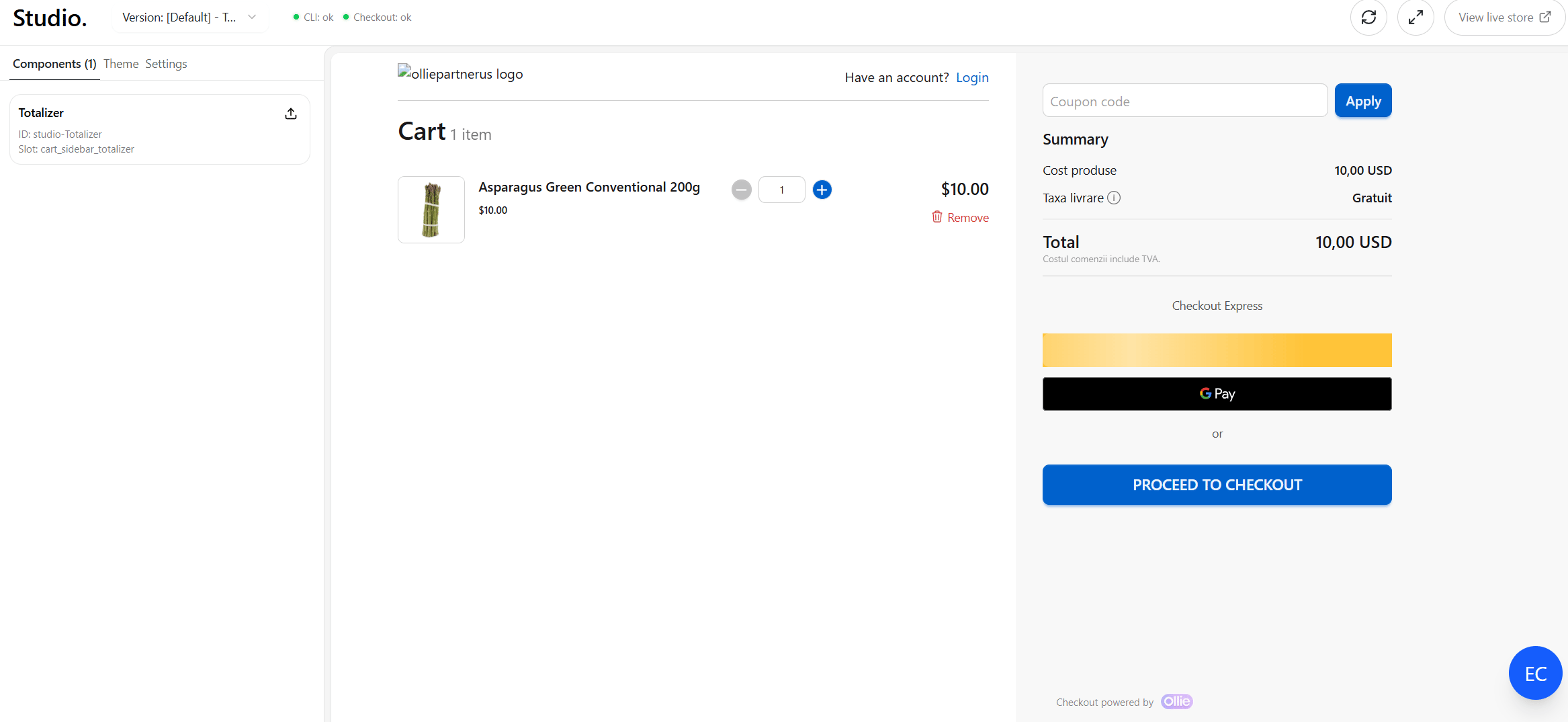
Studio: version selector and connection status in the header, sidebar on the left, live checkout preview on the right
Studio reads your in-progress components from the local dev server on http://localhost:4000. Start your project’s dev server before opening Studio so your components show up and can be deployed.
dev server (localhost:4000) │ manifest + live reload ▼Admin → Studio ──▶ checkout preview (your store)
The dev server builds your project and exposes a component manifest plus a live-reload stream. Studio loads the manifest, pushes each component into the checkout preview, and re-pushes a component whenever you edit it. Two header indicators show this pipeline’s health:
CLI: whether Studio can reach the local dev server (and whether the build is healthy).
Checkout: whether the preview has loaded and is ready to receive components.
Version selector: choose which version the preview loads.
CLI / Checkout status dots: green = ok, yellow = connecting, red = error.
Reload preview: reloads the checkout preview.
Maximize / Restore: hides the sidebar to give the preview full width.
View live store: opens the same checkout in a new tab.
Components tab
Lists every component found in your local project. Each card shows the component name, its id, and its assigned slot.
Click a name to open its props panel.
Open the ⋯ menu to Deploy it, or to Duplicate it.
If the dev server isn’t running, the tab tells you to start it.
Duplicate copies the component’s entry in your project’s ollie.json into a second entry over the same folder, keyed by a generated alias (GlobalPixels-copy-a1b2c3) instead of a component id:
The copy shows up as a second, unlinked component: same source, its own slot and props. Deploy it to register it in your store — the alias is then replaced by the new component’s id. Available on projects using the ollie.jsoncomponents map (not the legacy per-folder meta.json).
Components tab: each card shows name, id, and slot, with a deploy action
Settings tab
Device: switch the preview between desktop (full width) and mobile (390px).
Start route: the path the preview loads (defaults to /cart). Edit and reload to preview another page.
A summary of how many components are linked vs unlinked.
Props panel
Selecting a component opens its editor, where you can edit its props and slot and toggle active.
Save persists props/slot/active (disabled for unlinked components).
Deploy bundles and publishes the component.
Back returns to the list.
Linked vs unlinked components
Linked: the component exists in the database (real id, tied to your store/version). You can edit its props and deploy updates.
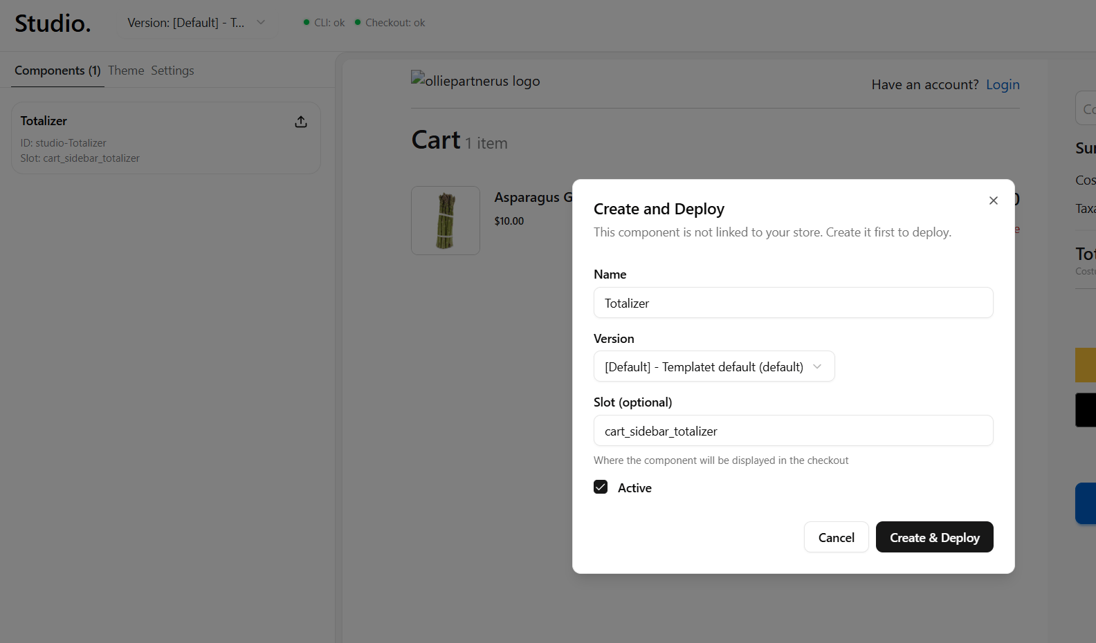
Unlinked: a local component Studio detected but that isn’t registered yet (its id starts with studio-). Create it first (the card’s upload icon starts the create flow) before you can save or deploy.
Studio can’t reach http://localhost:4000. Start the dev server in your project, allow the browser local-network access if prompted (Studio’s overlay has step-by-step instructions), then click Reconnect.
'No components detected'
The dev server is connected but the manifest is empty. Confirm your components live in the project the dev server is serving and that they build without errors.
Preview is blank or stale
Use Reload preview. If one component didn’t update, check the CLI dot. A red dot usually means a build error in that component.
Can't Save a component
Saving is disabled for unlinked components. Use the create flow first (upload icon on the card), then edit and save.