Take a look at our onboarding tutorial and learn how create and deploy a custom component
Component Architecture
Components follow a simple pattern:index.tsx
Creating Components
Components are created through the admin dashboard: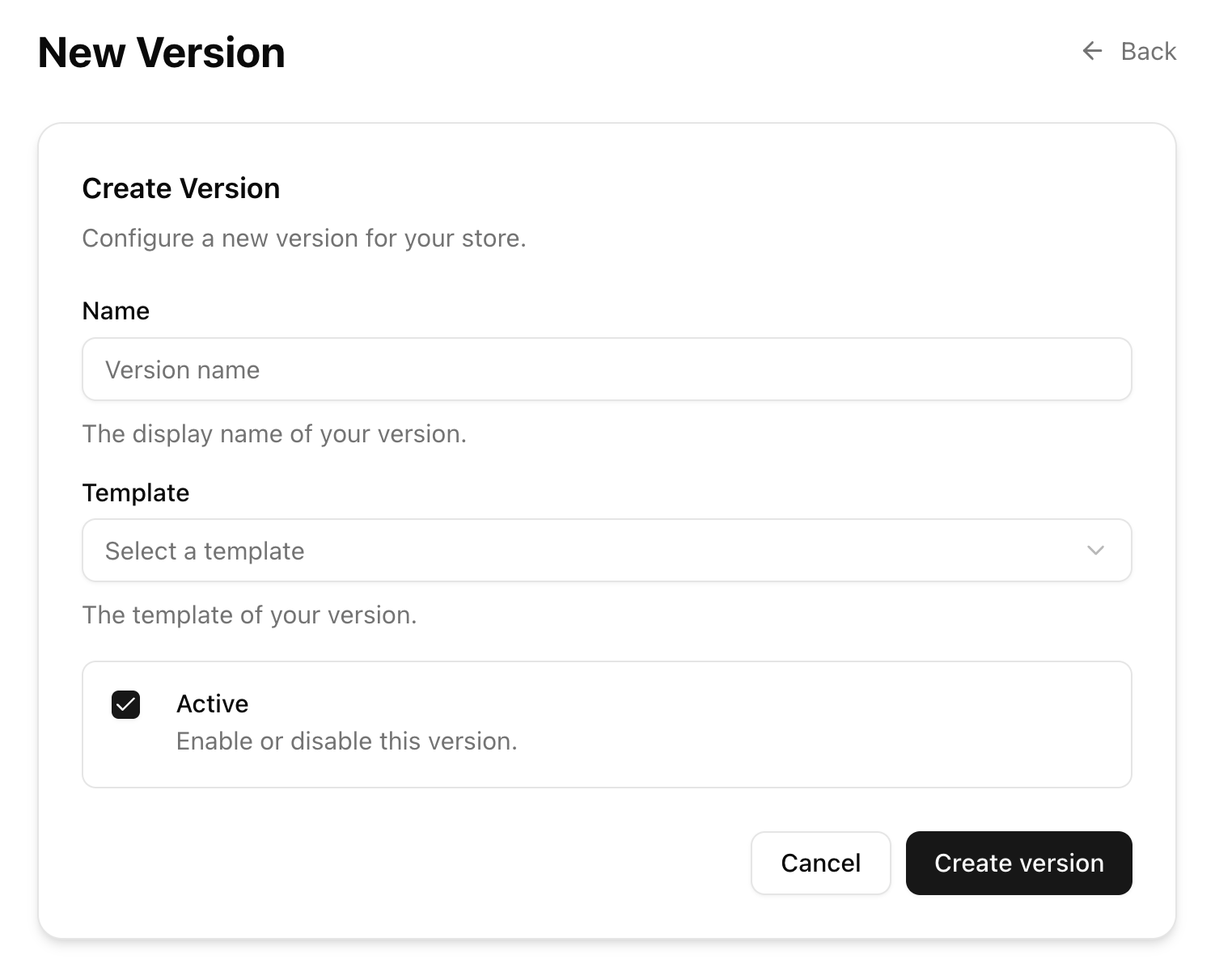
Name- Descriptive component nameSlot- Where the component will appearVersion- Which store version to deploy toStatus- Active/inactive