
color-primary and every button, link and focus ring that uses it follows.
Tokens follow the daisyUI naming, so each color comes with a -content partner: the color used for text and icons drawn on top of it.
Where to edit
- Admin → Versions → your version → Theme Configuration, a table of every token with an inline editor. Changes save automatically.
- Ollie Studio → Theme tab, the same tokens grouped by purpose, with a live contrast check and an explicit Save changes button. Use this one when you want to see the result in the preview.
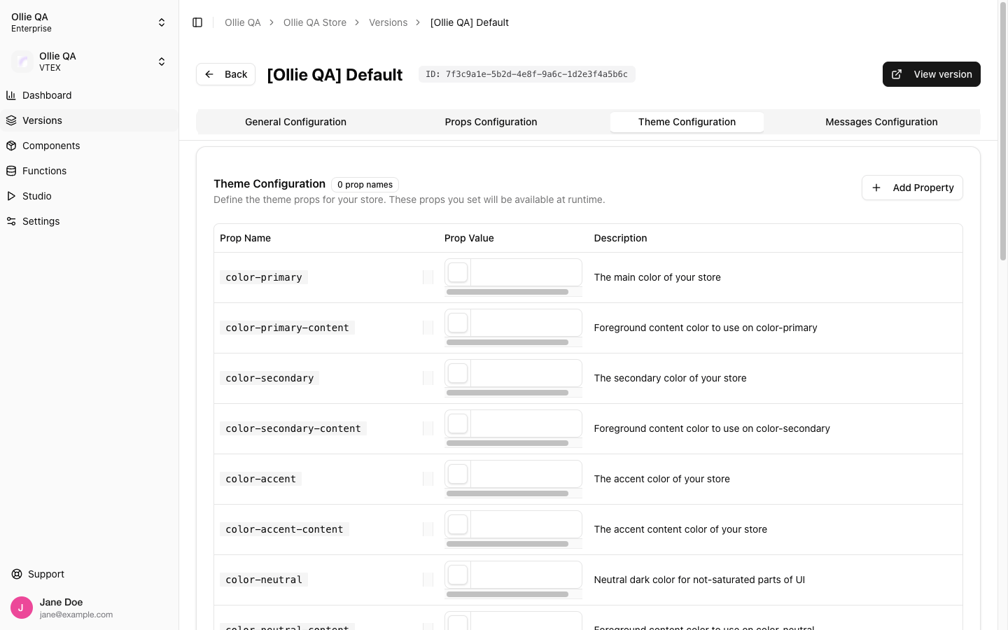
Versions → Theme Configuration
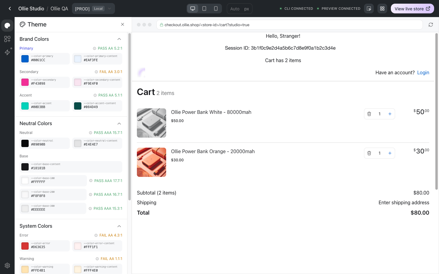
The same tokens in Studio, with contrast ratings
The tokens
Colors
Values must be hex colors (#0061cc). Other notations are ignored by the color field.
Shape and size
How saving works
In the Admin tab there is no Save button. Each edit is written to the version about a second after you stop typing, and the checkout picks it up on its next load. A failed save shows “Failed to save theme”; a successful one shows nothing. To go back to the template’s default for a token, delete the row with the trash icon. An empty token is not written to the checkout, so the template’s own CSS applies again.Edit the predefined tokens inline in the table. Use Add Property only for custom tokens you type by hand.
How tokens reach the checkout
Every token becomes a CSS custom property on:root, prefixed with --. color-primary is available as var(--color-primary), radius-box as var(--radius-box), and so on. Custom components can use them directly, which keeps your components on-brand across versions without any code change:
styles.module.css
useStoreInfo().theme returns the same tokens as a flat record keyed by the CSS variable name:
Related
- Ollie Studio: edit the theme with a live preview and contrast checks
- Fonts: the font is a version prop, not a token
- Custom Icons: icons read
--icon-filland--icon-strokefrom the same system