> ## Documentation Index
> Fetch the complete documentation index at: https://docs.ollie.shop/llms.txt
> Use this file to discover all available pages before exploring further.
# Studio
> Preview your in-progress components in the real checkout and deploy them, all from the Admin dashboard
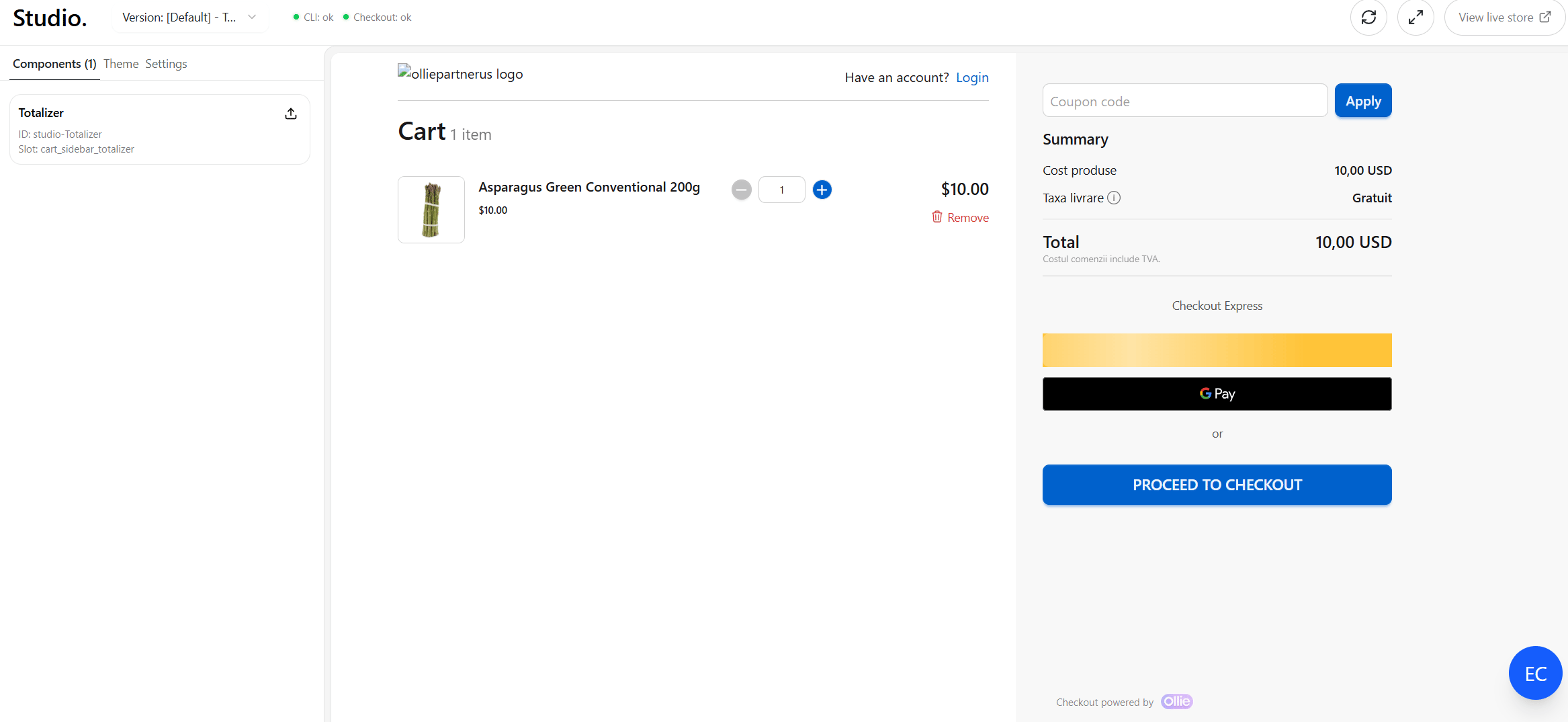
**Studio** (in the Admin dashboard, **Admin → Studio**) renders your store's real checkout in a live preview and shows the components you're developing locally, so you can see changes before publishing. When a component is ready, you deploy it to production from the same screen.
 Studio reads your in-progress components from the local dev server on `http://localhost:4000`. Start your project's dev server before opening Studio so your components show up and can be deployed.
## How it works
```
dev server (localhost:4000)
│ manifest + live reload
▼
Admin → Studio ──▶ checkout preview (your store)
```
The dev server builds your project and exposes a component manifest plus a live-reload stream. Studio loads the manifest, pushes each component into the checkout preview, and re-pushes a component whenever you edit it. Two header indicators show this pipeline's health:
* **CLI**: whether Studio can reach the local dev server (and whether the build is healthy).
* **Checkout**: whether the preview has loaded and is ready to receive components.
## Reference
* **Version selector**: choose which version the preview loads.
* **CLI / Checkout status dots**: green = ok, yellow = connecting, red = error.
* **Reload preview**: reloads the checkout preview.
* **Maximize / Restore**: hides the sidebar to give the preview full width.
* **View live store**: opens the same checkout in a new tab.
Lists every component found in your local project. Each card shows the component **name**, its **id**, and its assigned **slot**.
* Click a name to open its **props panel**.
* Click the **upload icon** to deploy it.
* If the dev server isn't running, the tab tells you to start it.
Studio reads your in-progress components from the local dev server on `http://localhost:4000`. Start your project's dev server before opening Studio so your components show up and can be deployed.
## How it works
```
dev server (localhost:4000)
│ manifest + live reload
▼
Admin → Studio ──▶ checkout preview (your store)
```
The dev server builds your project and exposes a component manifest plus a live-reload stream. Studio loads the manifest, pushes each component into the checkout preview, and re-pushes a component whenever you edit it. Two header indicators show this pipeline's health:
* **CLI**: whether Studio can reach the local dev server (and whether the build is healthy).
* **Checkout**: whether the preview has loaded and is ready to receive components.
## Reference
* **Version selector**: choose which version the preview loads.
* **CLI / Checkout status dots**: green = ok, yellow = connecting, red = error.
* **Reload preview**: reloads the checkout preview.
* **Maximize / Restore**: hides the sidebar to give the preview full width.
* **View live store**: opens the same checkout in a new tab.
Lists every component found in your local project. Each card shows the component **name**, its **id**, and its assigned **slot**.
* Click a name to open its **props panel**.
* Click the **upload icon** to deploy it.
* If the dev server isn't running, the tab tells you to start it.
 * **Device**: switch the preview between **desktop** (full width) and **mobile** (390px).
* **Start route**: the path the preview loads (defaults to `/cart`). Edit and reload to preview another page.
* A summary of how many components are **linked** vs **unlinked**.
Selecting a component opens its editor, where you can edit its **props** and **slot** and toggle **active**.
* **Save** persists props/slot/active (disabled for unlinked components).
* **Deploy** bundles and publishes the component.
* **Back** returns to the list.
* **Linked**: the component exists in the database (real id, tied to your store/version). You can edit its props and deploy updates.
* **Unlinked**: a local component Studio detected but that isn't registered yet (its id starts with `studio-`). Create it first (the card's upload icon starts the create flow) before you can save or deploy.
## Deploying from Studio
* **Device**: switch the preview between **desktop** (full width) and **mobile** (390px).
* **Start route**: the path the preview loads (defaults to `/cart`). Edit and reload to preview another page.
* A summary of how many components are **linked** vs **unlinked**.
Selecting a component opens its editor, where you can edit its **props** and **slot** and toggle **active**.
* **Save** persists props/slot/active (disabled for unlinked components).
* **Deploy** bundles and publishes the component.
* **Back** returns to the list.
* **Linked**: the component exists in the database (real id, tied to your store/version). You can edit its props and deploy updates.
* **Unlinked**: a local component Studio detected but that isn't registered yet (its id starts with `studio-`). Create it first (the card's upload icon starts the create flow) before you can save or deploy.
## Deploying from Studio
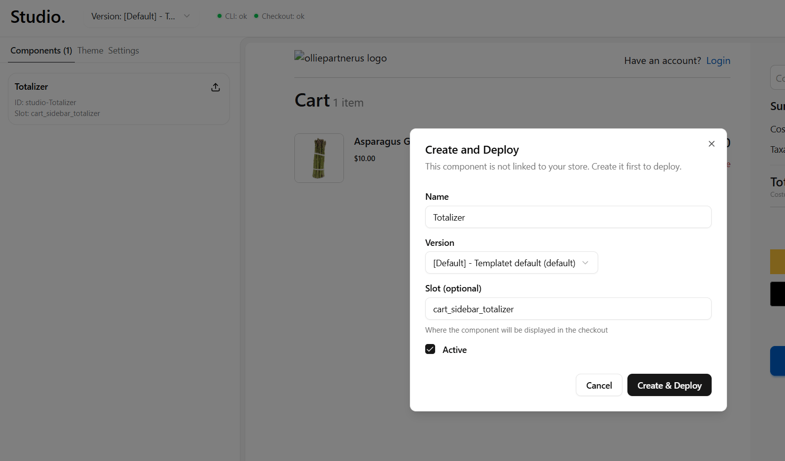 1. Make sure the **CLI** dot is green and the build has no errors (deploy is disabled on build errors).
2. Click the **upload icon** on a component card, or **Deploy** in the props panel.
3. Confirm in the dialog. Studio bundles the component, uploads it, and polls the build status until it succeeds (or surfaces a failure).
## Troubleshooting
Studio can't reach `http://localhost:4000`. Start the dev server in your project, allow the browser local-network access if prompted (Studio's overlay has step-by-step instructions), then click **Reconnect**.
The dev server is connected but the manifest is empty. Confirm your components live in the project the dev server is serving and that they build without errors.
Use **Reload preview**. If one component didn't update, check the **CLI** dot. A red dot usually means a build error in that component.
Saving is disabled for **unlinked** components. Use the create flow first (upload icon on the card), then edit and save.
## Related
* [Quickstart](../get-started/quickstart.mdx) — set up your project and preview in Studio
* [Payment Slots](./payment-slots.mdx) — building custom payment-method components
* [Components](../concepts/component.mdx) — how components work
* [Theme](../configuration/theme.mdx) — theming the checkout
1. Make sure the **CLI** dot is green and the build has no errors (deploy is disabled on build errors).
2. Click the **upload icon** on a component card, or **Deploy** in the props panel.
3. Confirm in the dialog. Studio bundles the component, uploads it, and polls the build status until it succeeds (or surfaces a failure).
## Troubleshooting
Studio can't reach `http://localhost:4000`. Start the dev server in your project, allow the browser local-network access if prompted (Studio's overlay has step-by-step instructions), then click **Reconnect**.
The dev server is connected but the manifest is empty. Confirm your components live in the project the dev server is serving and that they build without errors.
Use **Reload preview**. If one component didn't update, check the **CLI** dot. A red dot usually means a build error in that component.
Saving is disabled for **unlinked** components. Use the create flow first (upload icon on the card), then edit and save.
## Related
* [Quickstart](../get-started/quickstart.mdx) — set up your project and preview in Studio
* [Payment Slots](./payment-slots.mdx) — building custom payment-method components
* [Components](../concepts/component.mdx) — how components work
* [Theme](../configuration/theme.mdx) — theming the checkout