 The basic HTML strucuture of a Free Shipping Progress Bar looks something like this:
```html index.tsx theme={"system"}
return (
<>
The basic HTML strucuture of a Free Shipping Progress Bar looks something like this:
```html index.tsx theme={"system"}
return (
<>
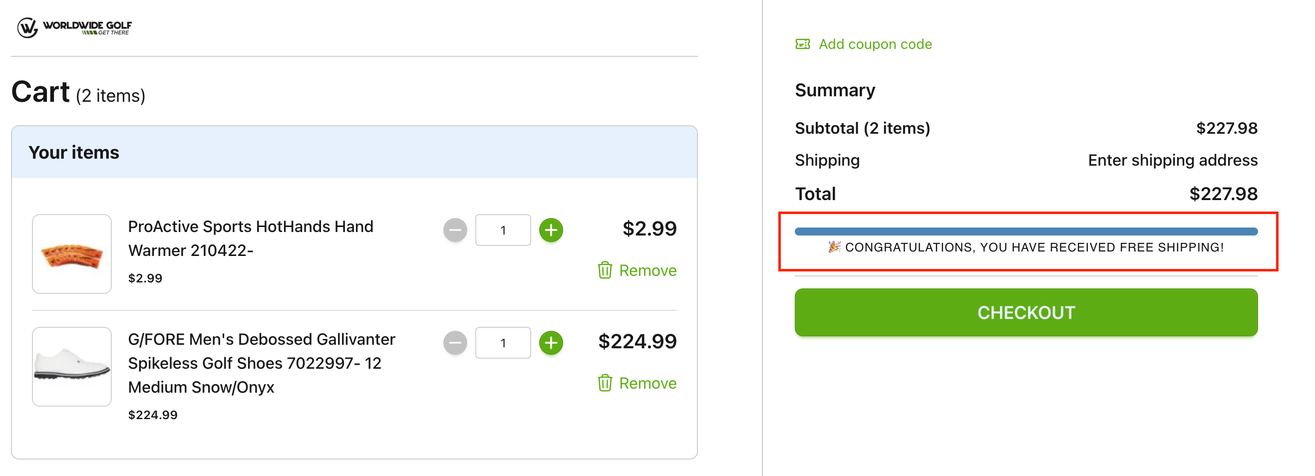
{missing > 0 ? `You are ${format(missing)} away from receiving Free Shipping` : "🎉 Congratulations, you have received free shipping!"}
{missing > 0 ? `You are ${format(missing)} away from receiving Free Shipping` : "🎉 Congratulations, you have received free shipping!"}